- Published on
Exploratory Analysis of a Twitter Archive
I finally had the chance of start working with R again and figured that analyzing my tweet archive would be a nice way of refreshing my skills. Although in the past it was necessary to parse JSON, Twitter now gives you a nice tweets.csv file containing all your tweets. Cool.
While googling for information on how to do this, I stumbled upon Julia Silge's blog (who coincidently also uses the So-Simple theme for her blog) and found that she had done most of what I wanted to do with my tweets, so this analysis is heavily based on hers.
library(dplyr)
library(ggplot2)
library(lubridate)
library(scales)

tw <- read.csv("tweets.csv", stringsAsFactors = FALSE)
Preprocessing
I used to talk to myself a lot (both in Twitter and real life), so I chose to separate tweets between "real" tweets, retweets, replies, and replies to myself. To do this, I got my Twitter id and simply checked whether the user I'm replying to is me or not.
own.id <- 271769778 # yup, that's me.
tw$timestamp <- ymd_hms(tw$timestamp)
tw$type <- "tweet"
tw[(!is.na(tw$in_reply_to_status_id)),"type"] <- "reply"
tw[(!is.na(tw$in_reply_to_status_id) & (tw$in_reply_to_user_id == own.id)),"type"] <- "r.self"
tw[(!is.na(tw$retweeted_status_id)),"type"] <- "RT"
tw[(tw$type == "tweet") & grepl("@", tw$text), "type"] <- "mention"   #Not a bulletproof aproach but good enough for this analysis
tw$type <- as.factor(tw$type)
tw$type <- factor(tw$type, levels(tw$type)[5:1])
Some Basic Twitter Behavior
All time
How does the frequency of my tweeting behave between 2011 and the end of 2015? (I haven't tweeted since Dec 2015 because reasons). Let's build some graphs using the wonderful ggplot and explore this a bit. I used theme_set(theme_gray(base_size = 14)) to make the text in the graphs bigger.
ggplot(tw, aes(timestamp)) +
geom_histogram(aes(fill = ..count..), bins = 60) +
xlab("Time") + ylab("Number of Tweets")
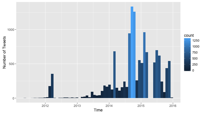
It seems I started tweeting a lot in the end of 2014 and had a couple of months off in 2015. This seems reasonable since I started working during the night on my thesis document and Twitter was a good way of keeping me awake. I also seem to have taken whole months off in 2011, 2012 and 2013. Hmmm, let's keep drilling down.
By year
ggplot(tw, aes(year(timestamp))) +
geom_histogram(aes(fill = ..count..), breaks = seq(2010.5, 2016, by = 1)) +
xlab("Time") + ylab("Number of Tweets")
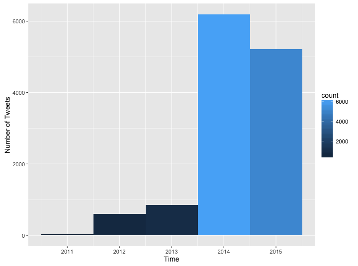
Whoa, the difference in the amount of tweets is quite big. What about the frequency by month?
By month
ggplot(data = tw, aes(x = month(timestamp, label = TRUE))) +
geom_bar(aes(fill = ..count.. )) +
xlab("Month") + ylab("Number of Tweets")
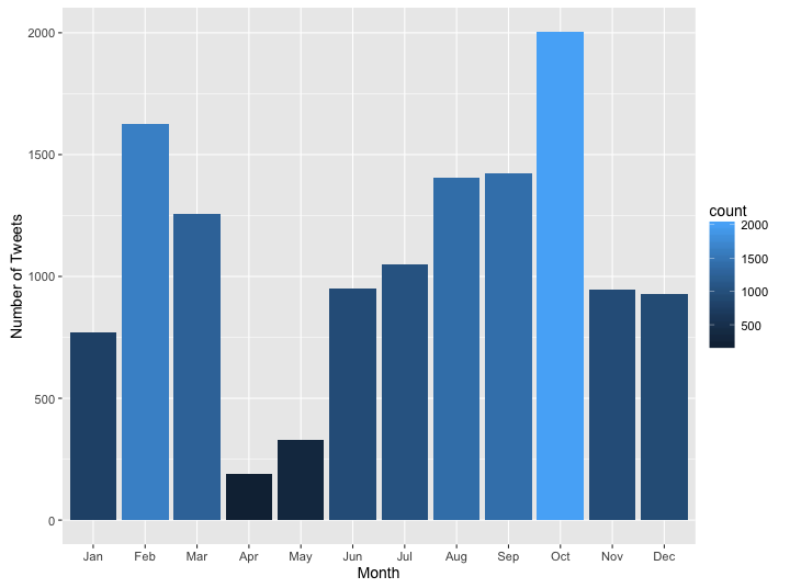
Ok, this one definitely looks weird, there is a clear difference between the number of tweets in March and April and the other months. I guess It makes sense for 2015 because April was the month of my thesis defense, so I shouldn't have had much time to tweet; however, this is definitely worth looking more in depth.
By day
ggplot(data = tw, aes(x = wday(timestamp, label = TRUE))) +
geom_bar(aes(fill = ..count.. )) +
xlab("Day of Week") + ylab("Number of Tweets")
By hour
tw$timeonly <- as.numeric(tw$timestamp - trunc(tw$timestamp, "days"))
class(tw$timeonly) <- "POSIXct"
ggplot(data = tw, aes(timeonly)) +
geom_histogram(aes(fill = ..count..)) +
theme(legend.position = "none") +
xlab("Time") + ylab("Number of tweets") +
scale_x_datetime(breaks = date_breaks("2 hours"), labels = date_format("%H:00"))
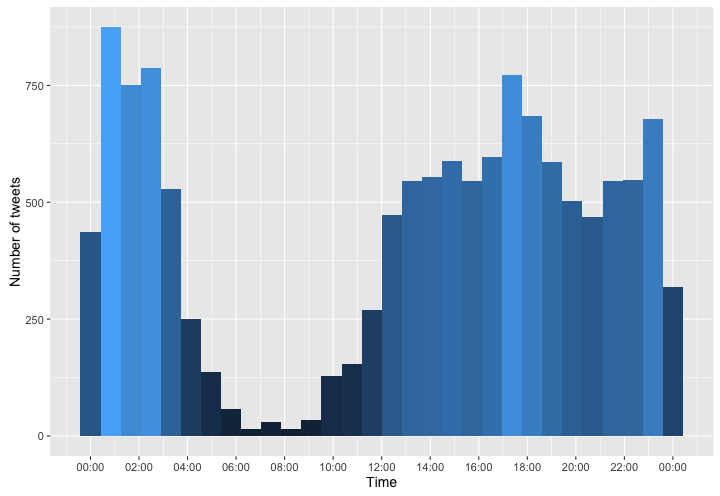
It seems like I was a pretty heavy Twitter user. This graph also shows what my sleeping habits used to look like (I had somewhere around 4 hours of sleep each night).
Tweets v Mentions v Retweets v Replies v Talking to Myself
What does the type of my tweets look like over time?
ggplot(tw, aes(timestamp, fill = type)) +
geom_histogram(bins = 60) +
xlab("Time") + ylab("Number of Tweets") +
scale_fill_brewer(palette = "Blues", direction = -1)
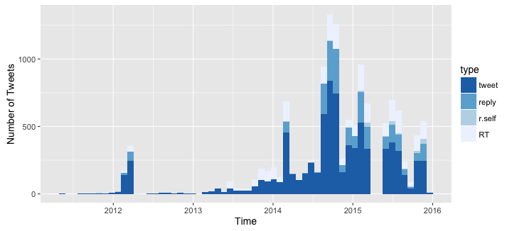
Well, it seems that in general I didn't talk to myself as much as I thought I did. However, there is an increase of "self replies" in 2015. I also thought that the amount of mentions was bigger, yet it doesn't seem so from looking at this graph.
Ok, lets see what how the proportion looks like:
ggplot(tw, aes(timestamp, fill = type)) +
geom_histogram(position = "fill", bins = 60) +
xlab("Time") + ylab("% of Tweets") +
scale_fill_brewer(palette = "Blues", direction = -1)
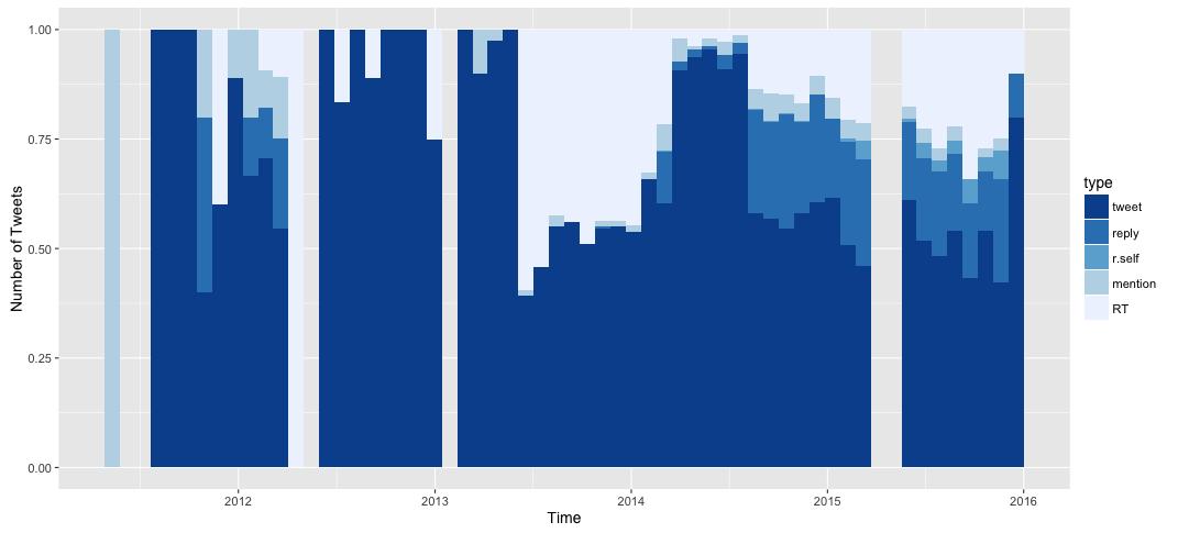
It seems there are months in which I only did mentions. Also, the months with not a single tweet are much more evident now. I already covered the months with no tweets on 2015, let's see what the absences before early 2013 are all about.
tw_early <- filter(tw, timestamp <= ymd("2013 03 01", tz = "America/Bogota"))

ggplot(tw_early, aes(timestamp, fill = type))  +
geom_histogram(position = "fill", bins = 22) +
xlab("Time") + ylab("% of Tweets") +
scale_fill_brewer(palette = "Blues", direction = -1)
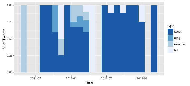
So, my early twitter career doesn't seem very impressive. There are a couple of mentions on April 2011 and then no tweets up to August. I was also absent on June 2012 and February 2013. However, I don't remember missing all those months. Unless...
The Tragic Tweet Fire
At some point I started to experiment with Twitter's API, but poor exception handling and ignoring of rate limits resulted in me deleting a lot of old tweets. This event plus the fact that I didn't use to tweet a lot before, would explain the weird pattern in March - April and the lack of tweets on the early years. So, when was this TTF? The earliest mention I could find among my existing tweets dates back to August 2014 but looking at the sources of my tweets, I found that I started experimenting with the API before March 2012. This makes reasonable to think that the TTF happened anytime in between. Ok, moving on.
How many characters?
What does the distribution of character counts in my tweets look like?
tw$charsintweet <- sapply(tw$text, nchar)
ggplot(data = filter(tw, type == "tweet"), aes(x = charsintweet)) +
geom_histogram(aes(fill = ..count..), binwidth = 8) +
xlab("Characters per Tweet") + ylab("Number of tweets")
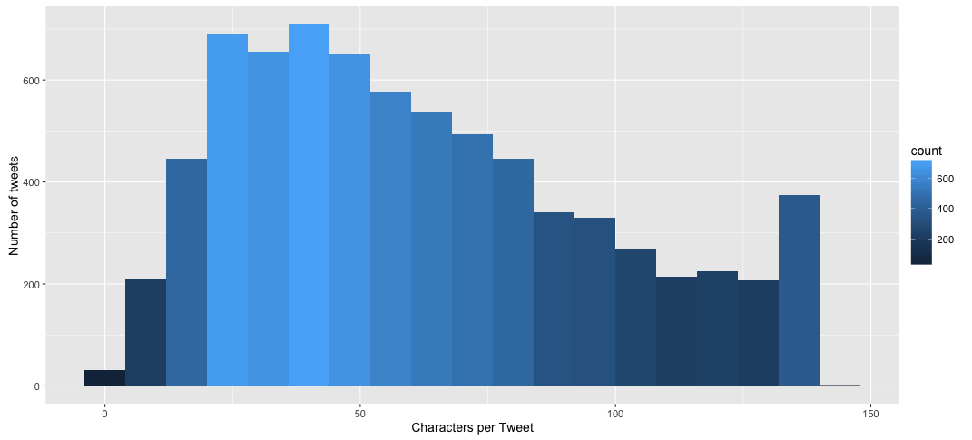
Woah, nice! I seem to be more likely to use few characters or go all the way in with 140. There are some weird tweets with more than 140 characters but it turns out that the extra ones are from special characters (\n, > and the like). Also, I don't remember using so little characters (less than ten):
Caramba.
— El gato. (@elgatoninja) December 3, 2015
¿Qué?
— El gato. (@elgatoninja) September 5, 2014
:(
— El gato. (@elgatoninja) March 3, 2014
Oh.
Fine, But What the Hell do All These Tweets Say?
> summary(tw$type)
  tweet   reply  r.self mention      RT
   7409    2304     151     542    2472

> nrow(filter(tw, type != "RT"))
  [1] 10406
Ignoring the TTF, I've written 10406 between tweets, replies, mentions and replies to myself. To see what all these tweets say, I used a really nice text mining package called tm which I would've loved knowing about when working on my thesis.
Preprocessing the tweets
library(tm)
library(stringi)

tw <- mutate(tw, text = stri_trans_general(text, "Latin-ASCII"))
stopwords <- c(stopwords("spanish"), stopwords("english"))

corpus <- Corpus(VectorSource(filter(tw,type != "RT")$text))
corpus <- tm_map(corpus, removePunctuation)
corpus <- tm_map(corpus, tolower)
corpus <- tm_map(corpus, removeWords, stopwords)
corpus <- tm_map(corpus, PlainTextDocument)

dtm <- DocumentTermMatrix(corpus)
freq <- colSums(as.matrix(dtm))
word.freq <- data.frame(word = names(freq), freq = freq)
I got a Document-Term matrix and a word frequency data frame. Let's see how the distribution of frequencies behaves.
The most frequent terms
> quantile(word.freq$freq, c(seq(.5, .8, .1), seq(.9,1,.01)))
50%  60%  70%  80%  90%  91%  92%  93%  94%  95%  96%  97%  98%  99% 100%
  1    2    2    3    7    8    8   10   11   13   15   19   27   42  383
Half of the words in my tweets after removing stopwords and with no stemming (we'll get to that in a bit) appear only once. Moreover, only 6% of them appear more than 10 times. However, this 6% still represents 868 words which wouldn't fit nicely in a graph. How about the top 50 most used words?
ggplot(arrange(word.freq, desc(freq)) %>% top_n(50)) + aes(word, freq) +
geom_bar(stat="identity", aes(fill = freq)) +
theme(axis.text.x=element_text(angle=45, hjust=1), legend.position = "none") +
xlab("Word") + ylab("Number of times")
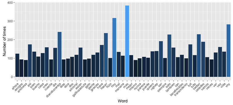
Huh. Even without retweets, user handles take a lot of the weight which seems to indicated that I interact with other users more than I thought. Also, handles appearing in the top of the list makes sense because they are always written in the same way, you either mention a person using the correct handle or you don't. On the other hand, since I haven't used stemming (yet), words that should be grouped together (e.g. eat, eating, eats) are being counted independently. Before moving on, let's see a nice word cloud with the current words.
library(wordcloud)

set.seed(42) # The answer the ultimate question of Life, the Universe and Everything
pal <- brewer.pal(9, "Blues")
pal <- pal[-(1:4)]
wordcloud(word.freq$word, word.freq$freq, min.freq=25, color = pal)
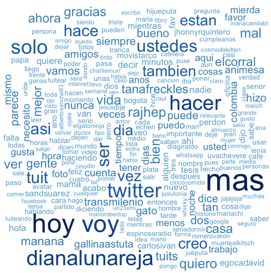
Dealing with handles
Knowing that I interact a lot with some people is nice, but handles are polluting the information about what I say on Twitter. Let's remove them and see what we get.
handle.pattern <- "@[a-zA-Z0-9_]+"

corpus.nh <- Corpus(VectorSource(
  (filter(tw, type != "RT") %>%
    mutate(text=stri_replace_all(text, "", regex=handle.pattern)))$text
))
corpus.nh <- tm_map(corpus.nh, removePunctuation)
corpus.nh <- tm_map(corpus.nh, tolower)
corpus.nh <- tm_map(corpus.nh, trimws)
corpus.nh <- tm_map(corpus.nh, removeWords, stopwords)
corpus.nh <- tm_map(corpus.nh, PlainTextDocument)

dtm.nh <- DocumentTermMatrix(corpus.nh)
freq.nh <- colSums(as.matrix(dtm.nh))
word.freq.nh <- data.frame(word = names(freq.nh), freq = freq.nh)

ggplot(arrange(word.freq.nh, desc(freq)) %>% top_n(50)) + aes(word, freq) +
  geom_bar(stat="identity", aes(fill = freq)) +
  theme(axis.text.x=element_text(angle=45, hjust=1), legend.position = "none") +
  xlab("Word") + ylab("Number of times")
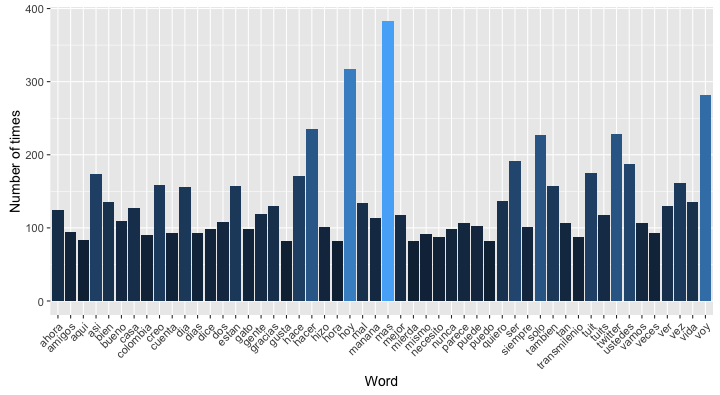
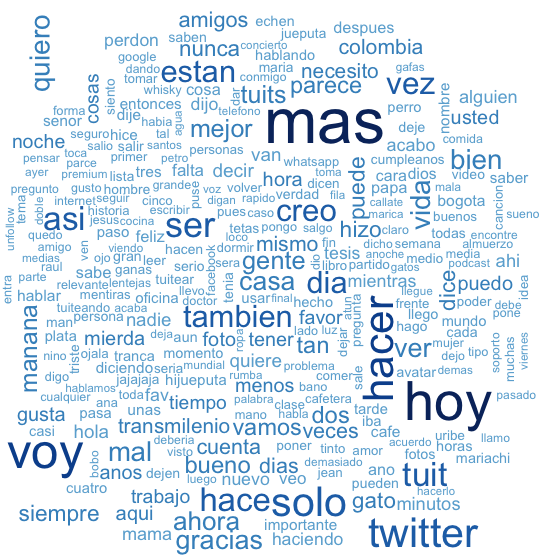
Let's see the word cloud again ignoring twitter handles.
wordcloud(word.freq.nh$word, word.freq.nh$freq, min.freq=25, color = pal)
Conclusion
This post has gotten very long and I still have some things I'd like to do with my Twitter archive. A more serious text analysis could be done on the tweets (e.g. Hierarchical clustering, K-means, sentiment analysis, etc.) so I guess I'll revisit this topics on a future post.
All the code used for this post can be found here.